Client: The LU-LU Cube
Graphic Design | Vector Illustration | Typography | Branding | Animation
The LU-LU Cube Project is a typographic exploration of duality, visibility, and self-expression within the LGBTQIA+ experience. Just as queer individuals often navigate the delicate balance between authenticity and societal expectation, this project visually embodies that tension.
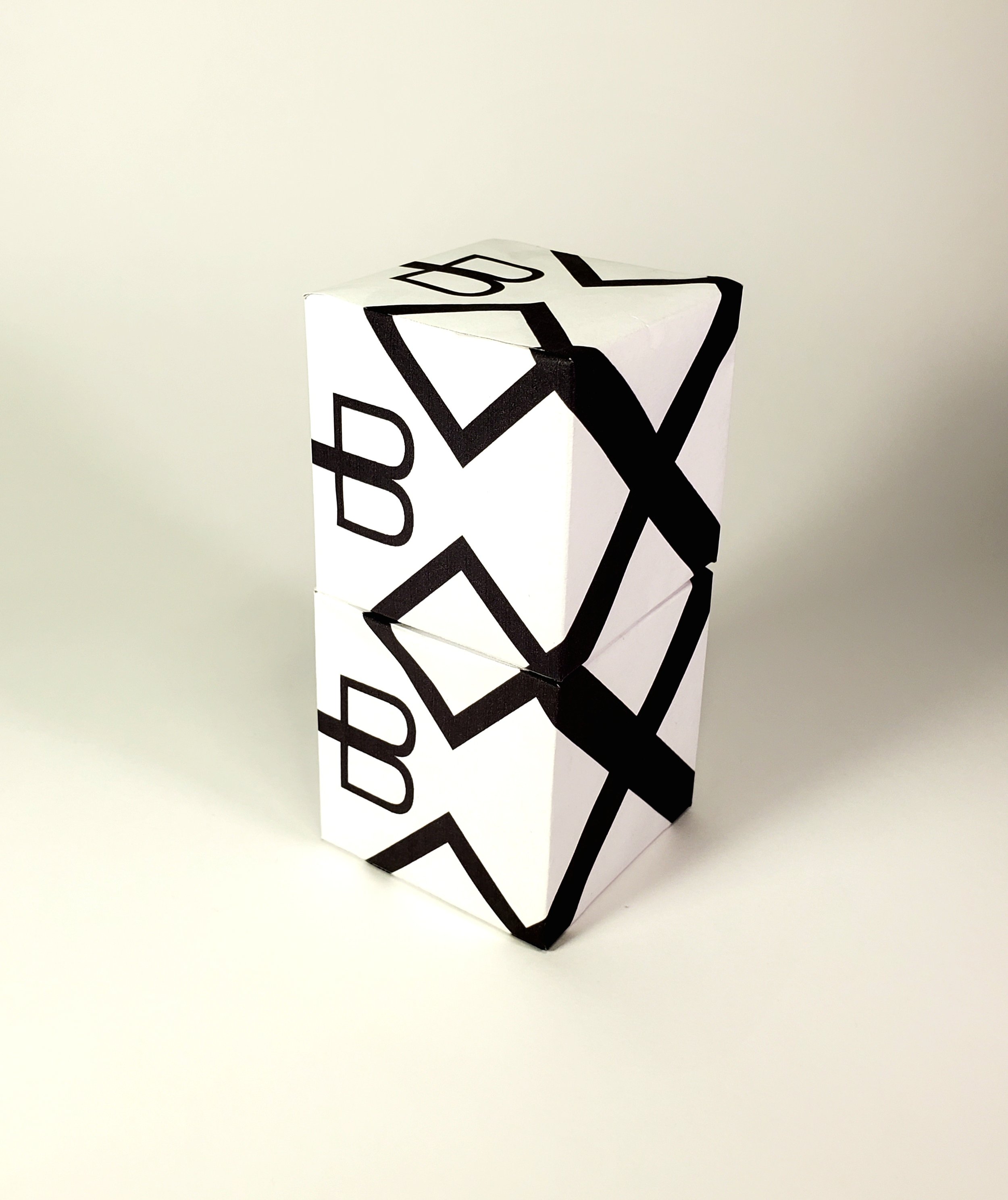
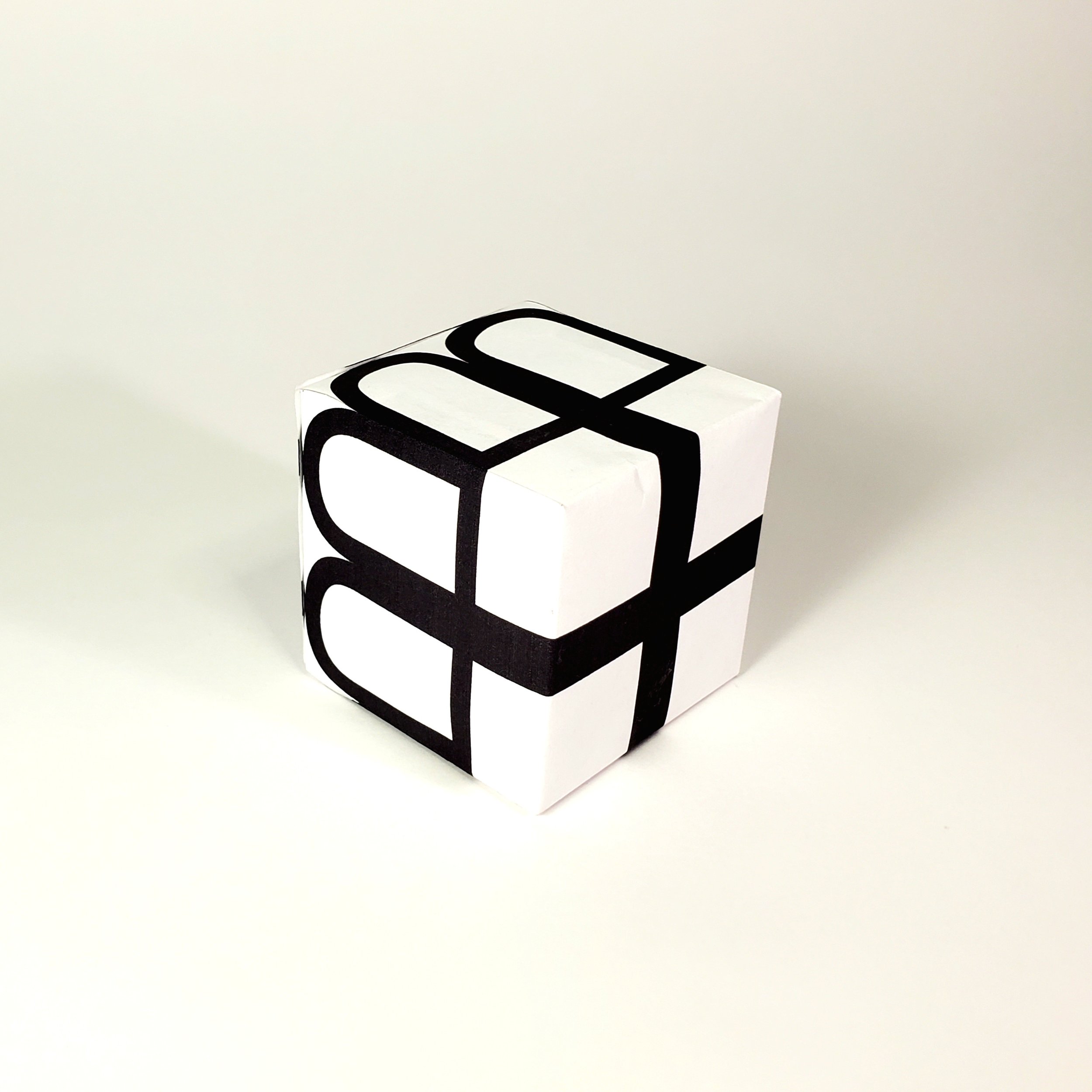
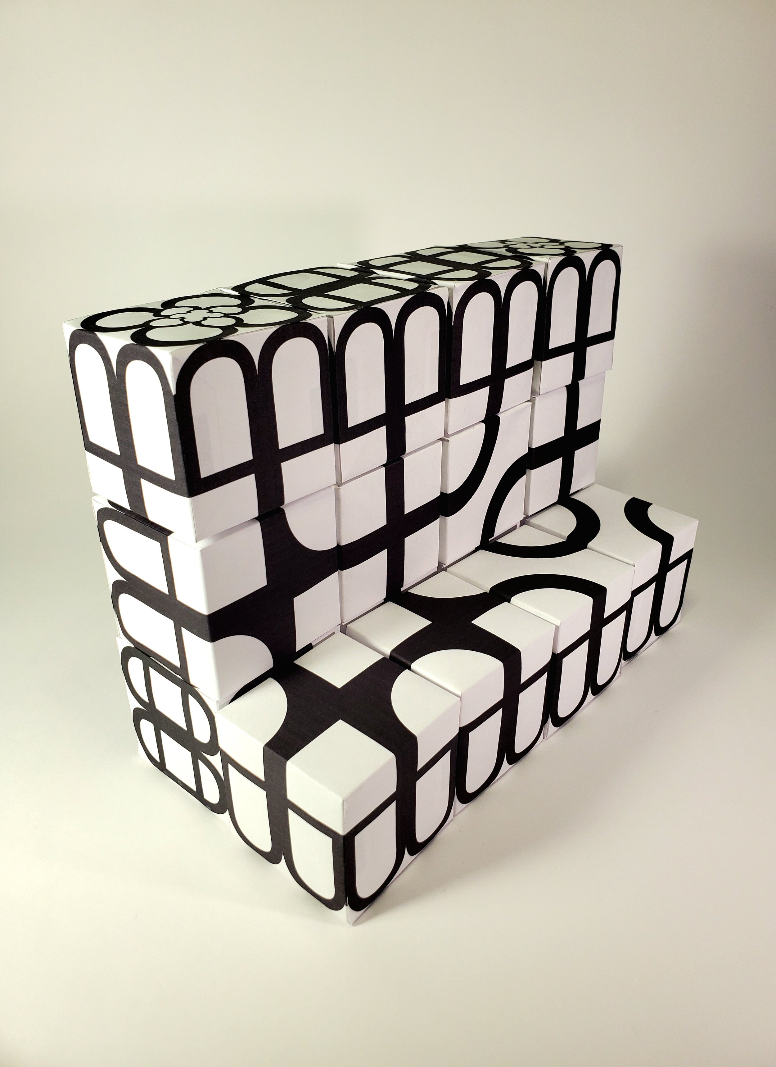
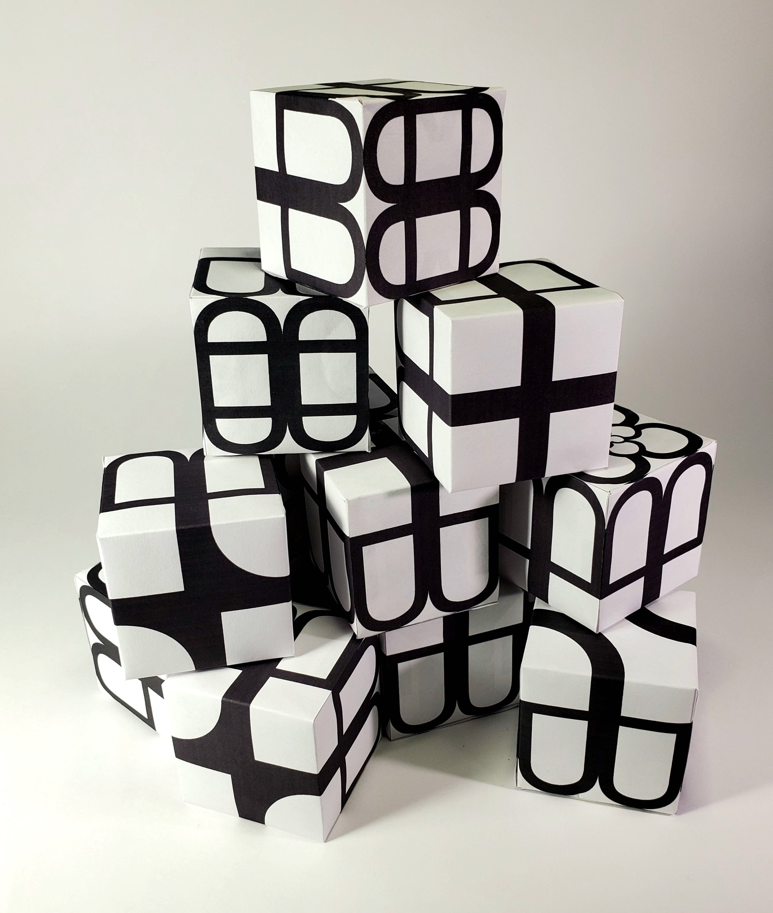
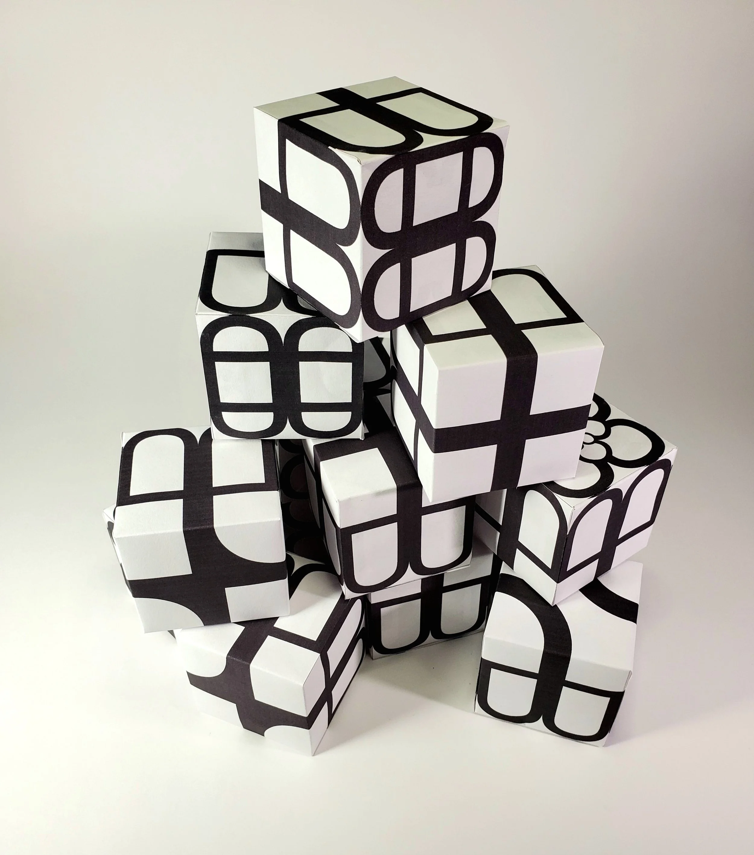
The cube’s true letterforms are intentionally obscured, echoing how many LGBTQ+ people conceal parts of themselves for safety, acceptance, or the ongoing journey of self-discovery. Two distinct letterforms, L and U, merge into a unified shape, symbolizing the fluid and often unseen layers of queer identity.


Inspired by the meditative nature of building blocks and jigsaw puzzles, the LU-LU Cube is an interactive artifact that explores the relationship between typographic characters in a three-dimensional environment. The name LU-LU comes from the interplay of the letters L and U, which serve as primary design elements across four of the cube’s faces, creating a visually rich structure.
"As a designer, accessibility was a key priority in creating this resource. The LU-LU Cube, crafted entirely from paper, is designed to be both visually engaging and easily attainable"
Printed using a standard, low-cost inkjet printer, this artifact can be effortlessly downloaded and enjoyed by anyone.


This typographic fusion is more than design, it is a metaphor for the complex relationship between visibility and concealment, reflecting the nuanced emotional terrain of queer life.
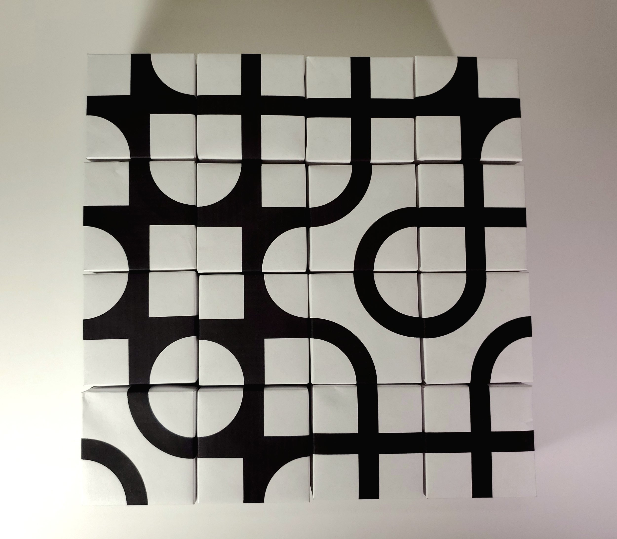
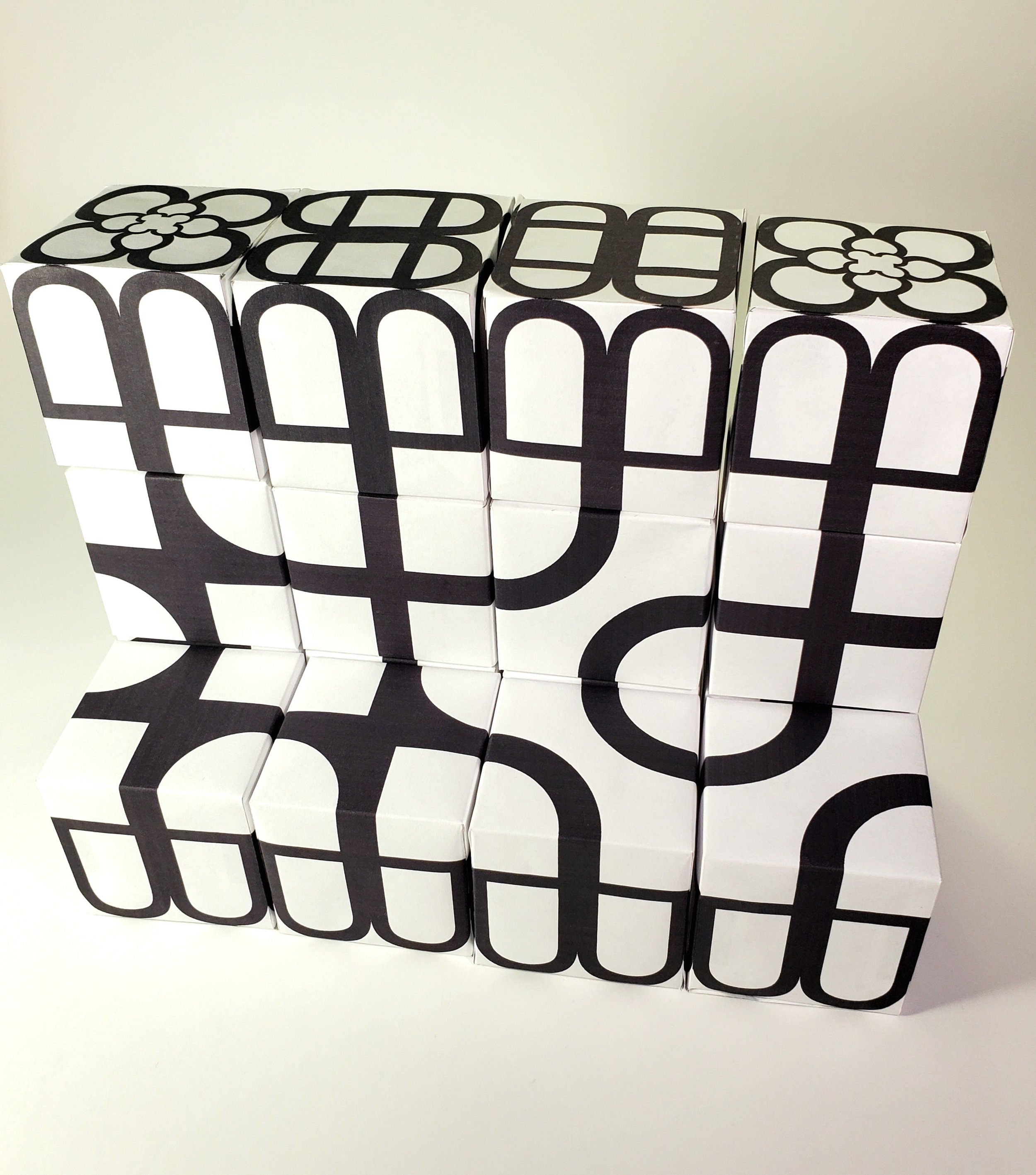
Designed to function fluidly in both two- and three-dimensional spaces, the LU-LU Cube invites viewers to engage with typography in a tactile, flexible way; mirroring the ever-shifting nature of identity and the many ways we shape, present, and inhabit ourselves.


The LU-LU Cube also invites playful interaction, encouraging viewers to rotate, reconfigure, and reinterpret its surfaces much like the way identity is explored and redefined over time. By allowing multiple perspectives and endless variations, the project challenges traditional notions of fixed meaning in typography and identity alike. This open-endedness creates space for personal connection, making the cube not just a design object, but a conversation starter about queerness, perception, and the power of subtle transformation.